Thursday, February 23, 2017

BIG | Alphabet of Light

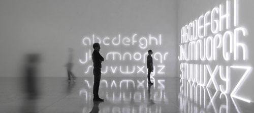
Danish firm BIG (Bjarke Ingels Group) has created a modular lighting system that can be rearranged to form different letters of a bespoke typeface.
Italian lighting company Artemide worked with architect Bjarke Ingels of BIG to create the ‘Alphabet of Light’ lamps. The alphabet series evolved from BIG’s creation of a new typeface that was translated and manifested as lighting modules that can be utilized either in straight or curved formats. The series use precise geometric proportions with elements of LED strip lights joined together by magnets that can be combined to build countless light structures, both essential and complex.


Tuesday, February 21, 2017

GRAPHIC MEANS | Before Design was Digital


It’s been roughly 30 years since the desktop computer revolutionized the way the graphic design industry works. For decades before that, it was the hands of industrious workers, and various ingenious machines and tools that brought type and image together on meticulously prepared paste-up boards, before they were sent to the printer.

The documentary, Graphic Means explores graphic design production of the 1950s through the 1990s—from linecaster to photocomposition, and from paste-up to PDF. 


WATCH TRAILER | Graphic Means

Friday, February 17, 2017

THE NEW TYPOGRAPHY

In the 1920s and 1930s, The New Typography movement brought graphics and information design to the forefront of the artistic avant-garde in Central Europe.

Letterforms were recognized by supporters of The New Typography as having formal properties alongside their linguistic function. From this simple observation, they created a system of graphic design that operated on abstract principles yet opened up limitless possibilities for layout, artistic expression, and clarity of communication. Rejecting superfluous elements and the traditional arrangement of type in symmetrical columns, designers organized the printed page and poster as blank fields in which blocks of type, bold colors (in many cases, the printed items were 2-color), and illustrations - frequently in the form of photomontage - could be arranged in strikingly asymmetrical yet harmonious compositions. With an emphasis on simplicity and directness of communication, this new movement embraced and circulated the message of modernism around the world.

Taking his lead from currents in Soviet Russia and at the Weimar Bauhaus, the designer Jan Tschichold codified the movement with accessible guidelines in his landmark book Die Neue Typographie (1928). Almost overnight, typographers and printers adapted this way of working for a huge range of printed matter, from business cards and brochures to magazines, books, and advertisements. 

Although young designers are still inspired by The New Typography movement today, working in a simple direct way like that, it’s not as easy as it looks.

Monday, February 13, 2017

KERN TYPE | A Kerning Game

The art of spacing is one of the most difficult aspects of working with letters. But anyone who works with letters extensively knows that good spacing is often more important than good letters. Jan Tschichold, Master Typographer says, “Good lettering demands three things:—(1) Good letters. A beautiful letterform must be selected which is appropriate to the purpose it is to serve and to the lettering technique to be used.—(2) Good design in all details. This calls for well balanced and sensitive letter spacing and word spacing, which takes the letter spacing into account.—(3) A good layout. A harmonious and logical arrangement of lines is essential. None of these three demands can be neglected. Good lettering requires as much skill as good painting or good sculpture.” He goes on to demonstrate “good and bad letters” and how to properly space capitals and lowercase letters. “Letter spacing should not be mechanically equal but must achieve equal optical space. The letters must be separated by even and adequate white areas”. Easier said than done. It is that balance of the inner and outer that makes for ideal letter spacing.

KernType is a game to practice your kerning. Your mission is simple: achieve pleasant and readable text by distributing the space between letters. Typographers call this activity kerning. Your solution will be compared to typographer’s solution, and you will be given a score depending on how close you nailed it. Good luck!

PLAY | http://type.method.ac/

Friday, February 10, 2017

THE BEAUTY OF HANGEUL | The Korean Alphabet

King Sejong the Great invented the Korean alphabet in the 15th century, but two key typeface designers from the modern era shaped it into what it looks like today.

Designers Choi Jeong-ho and Choi Jeong-soon created a blueprint for the Hangeul typeface that's still in use in the present-day, and their creations have made the alphabet more functional and artistically valuable. They designed fonts like Batang Che, which are now essential in the lives of Koreans.

The designers worked out of a sense of duty, as creating fonts did little to alleviate the hardships they would have faced at the time.

The National Hangeul Museum is holding an exhibition of their artifacts and achievements celebrating the 100th anniversary of the birth of the two designers.


WATCH | ​
National Hangeul Museum - Hangeul Learning Center

Tuesday, February 7, 2017

​WIM CROUWEL | New Alphabet & Joy Division


The career of Dutch designer Wim Crouwel spans six decades and covers an extraordinary journey from designer, teacher, curator to museum director.

Based on modernist principles, Crouwel's lucid and systematic approach to design is underpinned by a grid-based methodology. His process​ ​distils a subject down to its absolute essence and in doing so he achieves great impact and purpose in both his exhibition and print design. Through his long and productive career he has produced exemplary work in exhibition design, and designed posters, calendars, typefaces, trademarks and stamps.

In the infancy of digital typography—as lead type, set by hand in heavy lead blocks or by machines that generated lines of metal type, was giving way to text set on screens—Crouwel saw an opportunity for an interesting experiment. Early computer screens—cathode ray tube (CRT) monitors—rendered images in fairly large pixels, making traditional curvilinear letterforms difficult to reconstruct, and so Crouwel set out to redesign the alphabet using only horizontal lines. NEW ALPHABET is, in Crouwel's words, "over-the-top and never meant to be really used," a statement on the impact of new technologies on centuries of typographic tradition. 


In 1988, however, Peter Saville Associates used a stylized version of the font on the cover of Substance, an album for the band Joy Division. NEW ALPHABET was digitized for contemporary use in 1997 by Freda Sack and David Quay of The Foundry, closely based on Crouwel's original studies.

WIM CROUWEL | Talking About Swiss Style 
https://youtu.be/eQCZuN1khPk

Friday, February 3, 2017

ARMIN HOFMANN | Swiss Design Visionary

Armin Hofmann has been described as one of the most outstanding personalities in Swiss graphic design history. Along with the more well known Josef Müller Brockmann, Emil Ruder and Max Bill, Hofmann helped shape modernist-inspired graphic design beyond recognition. Without ‘The International Typographic Style’, also known as the Swiss Style of design, contemporary graphic design would be almost unrecognizable. The readability and cleanliness of the style as well as its asymmetric layouts, use of a grids and sans-serif typefaces have helped define how we design today. Designers today are still taking the best elements from this era of design to create a whole new contemporary, visual aesthetic.

Hofmann was born in Winterthur, Switzerland, in 1920. He studied at the School of Arts and Crafts in Zurich, then worked as a lithographer in Basel and Bern. He then went on to open his own studio in Basel. In 1947 he began teaching at the Basel School of Arts and Crafts after he met Emil Ruder on a train and learned that the school was looking for a new teacher. Hofmann remained there for 40 years and eventually replaced Emil Ruder as the head of the school.

Hofmann felt that one of the best and most efficient forms of communication was the poster and he spent much of his career designing posters, in particular for the Basel Stadt Theater. Just as Joseph Müller-Brockmann and Emil Ruder had done previously, Hofmann also wrote a book outlining his practices and philosophies. His ‘Graphic Design Manual’ was, and still is, an excellent reference book for graphic designers.

The style of design that Hofmann and Ruder created aspired to communication above all else. It showed new techniques of photo-montage, photo-typesetting, experimental composition in general and of course heavily favoured sans-serif typography. It could be said that Hofmann devoted his entire professional life to bringing a creative and artistic integrity to the world of graphic design.

“As a human being he is simple and unassuming. As a teacher, he has few equals. As a practitioner, he ranks among the best” “…He is a rare bird, a daredevil driver, a mountain climber, a teacher par excellence, and a guru. Yet it is difficult, really, to pin him down.”– Paul Rand of Hofmann

Hofmann’s work, especially his poster designs, always seemed to emphasize an economical and efficient use of colour and typefaces. This was in reaction to what Hofmann called the “trivialization of colour.” His posters have been exhibited as works of art in major galleries all around the world, including the New York Museum of Modern Art. He retired in 1987 but his legacy lives on in his hugely influential body of work.

WATCH | Armin Hofmann: AIGA Medalist​  https://youtu.be/pSrNGbwVKQs

Wednesday, February 1, 2017

HERB LUBALIN | Typographer Extraordinaire


Most people recognize the name Herb Lubalin in association with the typeface Avant Garde. He was the typographer and designer behind its creation.  With the success of Avant Garde Magazine and its typographic logo he became a constant boundary breaker on both a visual and social level, but his career spanned a much wider scope than that. One of the people behind culture-shocking magazines Avant-Garde, Eros and Fact, he was also part of the founding team of the International Typeface Corporation (ITC). It was hard to escape the reach of Herb during the 1960s and 70s. 

His constant search for something new and a passion for inventiveness made him one of the most successful art directors of the 20th century.  Constantly working and achieving much success throughout his career, at the age of 59 he proclaimed "I have just completed my internship."

His influence on typeface and magazine design can still be seen to this day and whilst his name is not widely known his styles and ideas are around for all of us to see.