Thursday, July 8, 2021

SEXUALLY UNAPOLOGETIC | Flamboyantly Fluid Type


New York-based type foundry Otherwhere Collective and designer/creative director Andrew Bellamy have created a seductively cheeky rebrand for TOCA, a range of high-potency CBD anal and vaginal lubes.

The new designs centre around a custom typeface, OC TOCA, which bears deliciously flamboyant, curving letterforms with an aesthetic that marries French turn-of-the-century, Art Deco elegance and eroticism with stylishly hippie-leaning '70s vibes.

"It's a rebrand more in line with their personality: it's elegant and sensual, playful with a subtle subversion and a sense of humor, positioned as affordable high-end," says Bellamy, who adds that the brand had said it "wanted to make some noise and talk about things considered taboo so that was a green light to break out of the cliché botanicals photography and be a bit more subversive and incendiary."

The references for the designs include collage artist Linder Sterling (she of the iconic cover design for The Buzzcocks single Orgasm Addict); rapper Foxy Brown; Grace Jones; Roxy Music (specifically the sleeve design for Country Life), Barney Bubbles' stunning work for space rock legends Hawkwind; vintage porn; German architect and industrial designer Peter Behren; Herb Lubalin and Ralph Ginzburg's collaborations on seminal1960s/70s editorial design for Eros, Fact and Avant-Garde; Jamie Reid (he of Sex Pistols sleeve design fame); Austrian graphic designer and painter Alfred Roller; designer Busby Berkeley (who's known for his cinematic "elaborate dancing-girl extravaganzas"); Austrian graphic artist Koloman Moser; and the rather brilliant campy, retro-futuristic 1970s/80s music genre, space disco.

BRODIE KAMAN | Avoiding the Unnecessary


BRODIE KAMAN'S TACTILE, TYPOGRAPHICALLY-LED PRACTICE

Berlin-based art director and graphic designer Brodie Kaman is a force to be reckoned with, boasting a captivating practice that combines a dynamic starkness with a relaxed, somewhat free-hand candidness across the work he does.

Creating work that bridges the gap between a rough, tactile, '90s aesthetic and aggressively contemporary design, Brodie commits to a very distinct style. He works primarily in the music industry, having recently created the design and typography for FKA Twigs' latest album Magdalene - a record cover/brand that is slick, striking and sophisticated as the record itself.


Producing designs with a solid punch to them, Brodie explains, "I don't set an intention for things to come across that way, but I prefer not to get caught up with unnecessary details for the sake of it. I've always been attracted to strong imagery," – where the visuals of which are a strong concept in themselves and not necessarily reliant on a rigorous, academic underpinning.


Tuesday, July 6, 2021

FUTURA FONT | Modern Makeover


UPDATED DESIGN PROVES CLASSICS SHOULDN'T ALWAYS BE LEFT ALONE.

Futura has long been one of the most-loved fonts in the design world. But, as you'll know if you've tried to use it digitally, it's somewhat of a struggle to do it effectively. Its problematic spacing and every-so-slightly odd range of weights mean that the only typeface to live on the moon is not adapting well to modern applications. 

Enter: Futura Now. An adaptation of the vintage Futura, which was introduced back in 1927 when Bauhaus was the only trend to follow, it's succeeded in making the font accessible and useable again. For digital environments, logotypes, and brand identities that want to imbue the timeless elegance of the bauhaus and deco styles, this collection of typefaces maintains the legacy of one of my favourite typefaces while giving it a well-deserved revival.

2021 GOUDY AWARD | Louise Fili


EXCELLENCE IN TYPOGRAPHY 

Louise Fili, an American graphic designer recognized for her elegant use of typography and timeless quality in her design, is the 2021 recipient of the Frederic W. Goudy Award for Excellence in Typography.

The daughter of Italian schoolteachers, Fili said she was “interested in design before she even knew what it was.” As a child she carved letterforms into her walls, designed book covers, and created illuminated manuscripts of Bob Dylan lyrics. A visit to her parents homeland in her teens inspired a life-long love of Italy. 


Considered a leader in the postmodern return to historical styles in book jacket design, Fili explores historic typography combined with modern colors and compositions. Fili’s work often draws on inspiration from her love of Italy, Modernism, and European Art Deco styles. She worked as a senior designer for Herb Lubalin and served for 11 years as art director of Pantheon Books, where she designed close to 2,000 book jackets.

In 1989, she opened Louise Fili Ltd., a design studio specializing in food, type, and all things Italian. Fili is author of more than 25 books on graphic design.

Wednesday, April 11, 2018

MID CENTURY TYPEFACE | A Reflection of Modern Architecture

HELVETICA AND THE COLD SANS SERIF

In the documentary film, Helvetica, graphic designer Michael Bierut sums up the mid-century modernisation of graphic design by describing a single Coke ad from 1969. “It’s the real thing. Period! Coke. Period! In Helvetica. Period! Any questions? Of course not. Drink Coke. Period! Simple.”

McKann Erickson’s campaign exemplifies a 1960s revolution of clean, modernist typography. The short, bold, sans-serif statement was a stark reaction to the hand-rendered script lettering and long-winded copy that cluttered print advertising of previous decades.

FUTURA AND THE CLINICAL SIDE OF MODERNISM

The credit for sparking this shift could go to Doyle Dane Bernbach, whose “Think Small” ad for Volkswagen turned heads in 1959. Designer Helmut Krone used a traditional ad layout: two-thirds image, one-third copy, with a headline between them. What made the ad so striking (besides the spare photography and Julian Koenig’s clever copy) were the short paragraphs punctuated by single-word lines, all set in a typeface rarely used for text: Futura.

Geometric and uniform sans serifs are indeed typographic symbols of modernism. But Futura, Helvetica, Univers, and Eurostile were by no means the only typefaces favoured by mid-century designers. To me, they represent the colder, clinical, machine-made side of modernism. More metal than wood.

A REFLECTION OF MODERN ARCHITECTURE

At its best, mid-century modernism married two moods: cold and warm. The strict, straight, and mechanical was tempered by a human touch and the imperfection of natural forms. And despite the emphasis on functionalism, the movement also had a sense of humour and whimsy. This was reflected as much in mid-century typography as it was in furniture and architecture.

Friday, April 28, 2017

COOPER BLACK | It's Back!

Fashion’s affairs with typefaces have been many – from the Didone styles of Vogue to the sans serifs favored by Chanel, Commes des Garçons and Fendi. But Cooper Black doesn’t have the sleek lines or sophistication you might expect from a sartorial squeeze. 

So where did this font surface from? And why has mainstream fashion gone so mad for it?
Paul McNeil, a typographic designer at MuirMcNeil and a senior lecturer in typography at the London College of Communication, thinks it has an “unexpected affability and liveliness … due partly to its bulbous serifs, its large, lower-case letters and its tiny, gleaming white counter forms.” 
It could well be its brand of familiar charm that is helping it win fashion’s favor now. It is all about retro nostalgia – it just says ‘1970s’ the minute you look at it.
It was created by Chicago-based typographer, illustrator and commercial artist Oswald “Oz” Cooper in 1922. It quickly became ubiquitous in advertising. It's foundry declared it to be the “world’s bestselling typeface in 1927”. It was marketed by the foundry’s sales manager Richard N McArthur as “the selling type supreme … it made big advertisements out of little ones”. But in the 60s, its gregarious characters fell slightly out of favor with the ad world.
Nevertheless, it has become visual shorthand for the late 60s and early 70s because it was in that era that it was brought out of adland and into the popular culture mainstream on a wave of west coast harmonies, appearing on the cover of the Beach Boys’ Pet Sounds in 1966 before going on to be the typeface of choice on the Doors’ LA Woman in 1971 and David Bowie’s Ziggy Stardust in 1972. It was the typeface of The Garfield Show and M*A*S*H.

It was also in this era that it kicked off another meaningful relationship: with hip-hop. Breakdancing crews used iron-on transfers of the letters on their T-shirts and it later appeared on albums and merchandise. More recently, in nods to the earlier DIY days of hip-hop, it has been used by Odd Future, on Tyler the Creator solo albums and Frank Ocean’s Channel Orange.
In a way, it was never out of fashion – it is something of an American street-culture classic. So when mainstream fashion chooses to adorn T-shirts with Cooper Black, it is subliminally referencing all these things – hip-hop, the 70s, sitcoms and now, Louis CK.
It is all of these cultural anchors that lead to another tenet of its popularity. With a sense of authenticity Cooper Black has a cheery gaucheness that makes it look untutored and uncontrived.

Wednesday, March 29, 2017

PIET ZWART | Everything Must Change

A fascinating documentary about Piet Zwart (1885-1977), an idiosyncratic and stubborn designer, who lived for innovation and prepared the way for the international success that is now known as Dutch Design. Piet Zwart worked as an interior and industrial designer, commercial typographer, photographer, critic and lecturer, playing a key role in defining the design climate in the Netherlands in the Twentieth Century. He is especially known for designing the famous ‘Piet Zwart’ kitchen for the Dutch company Bruynzeel: a kitchen that could be easily produced and consisted of standardized elements. His versatility and influence on present-day designers led the Association of Dutch Designers to award him the title of “Designer of the Century” in 2000.
Piet Zwart is counted among the international avant-garde without any reservations. His work reflects the work of artists such as Kurt Schwitters, El Lissitzky, Laszlo Moholy-Nagy, Jan Tschichold, but always retains its own authenticity. His work corresponded with similar experiments at the Bauhaus, where Piet Zwart was a teacher.
This documentary enters the mind of the artist Piet Zwart with his almost obsessive urge to innovate.


Monday, March 27, 2017

TYRSA x LIBERTÉ | Le Tyrsamisu

The arts of pastry-making and typography came together at LIBERTÉ patisserie in Paris to present a touch of sweetness engraved with dark chocolate tones: the TYRSAMISU. 

Pastry chef Benoit Castel, in collaboration with the famous Parisian graphic artist Alexis Taieb aka Tyrsa reinterpreted the famous Italian tiramisu with three different recipes that are as savory as they are graphical. 

Watch the process of the two art forms slowly coming together creating and exquisite dessert combining two of my favourite things...pastry-making and typography.


If you're feeling inspired, here’s an easy Tiramisu recipe, minus the typography.

Monday, March 20, 2017

PINK FLOYD RECORDS | New Visual Identity


Design consultancy firm Pentagram has created a new identity for Pink Floyd Records, the label established to put out the recent Pink Floyd: the Early Years boxset.

The project saw the team, led by partner Harry Pearce, take the original lettering from the Animals album and extend it into an entire alphabet.


“Pink Floyd’s impact on music is immeasurable, and is only seconded by their impact of visual culture. Famed by their relationship with the design collective Hipgnosis, their LP covers are part of the cultural consciousness, creating moments of shared experience for millions of people around the world,” says Pentagram.

Harry worked closely with Aubrey Powell of Hipgnosis to create the visual identity for the label. Taking inspiration from the original lettering on 1977’s Animals record cover, Harry and team build a complete alphabet based on the album’s stencilled lettering in both outline and solid form. This lettering has been used to make a unique mark and headline font for the band and business.


The box set, which features previously unreleased material including the band’s first recording, you will find original artworks by John Whitely have been used on the CD booklet covers. “The box sets follow a simple one column grid and uses typewriter-esque typography to create an archival aesthetic, which is built upon through the careful arrangement of historical photographs of the band,” says Pentagram.


Wednesday, March 8, 2017

SEXY TYPE | The Classics

Can type be sexy? Erotic art has existed since prehistoric man started painting on cave walls. The first
erotic alphabets appeared soon after the invention of printing in the mid-15th century, yet these were illustrations rather than type, with copulating human bodies creating the letter forms. 

However, for one decade – from the early 1970s to the early-to-mid 1980s – erotic art and commercial art converged during the Golden Age of Porn. Recurring typefaces on adult film posters of the porno chic period were characterised by soft and voluptuous letter forms, curvacious shapes with swirling swashes and ligatures, big ball terminals and liquid loops. 

The fonts below feature the classic sexy faces from the 70s.

CASLON GRAPHIQUE


The extreme contrast and generous forms in Caslon Graphique make its character shapes particularly voluptuous, with enticing pear-shaped terminals.


DIDONI


Not only are the ball terminals in this extra bold modern face exceptionally big, Didoni also sports one of the sexiest ampersands.


TANGO


Colin Brignall designed the Tango typeface in 1974. A groovy swirl of a font, Tango looks like disco party ready to lift off. Tango is one of many fonts that have come to symbolize the party music of the 1970s, familiar forms can be found on countless album covers from that era. Tango is a child of it's times - flashy, lively, and fun!


COOPER BT


When looking from up close the reader can imagine the shape of the female body in the rounded serifs and sensuous curves of Oswald Cooper’s eponymous display face.


EF STILLA


If you are in need of sensual curves and big balls you need not look any further than this high-contrast French buxom beauty.


LAZYBONES


The neo-script Lazybones entices the reader with bulging reverse-contrast curves and thick, meaty swashes on its soft slab serif capitals.

Tuesday, March 7, 2017

​RYMAN ECO | The Alphabet Poster Project​

Ryman Eco is a beautiful, free, sustainable font that uses one third less ink than standard fonts and 27% less ink than the leading sustainable font. The font is cleverly designed to capitalize on the ink bleed and toner spill that occurs on home and office printers.​

It is 
estimated that if everyone used the font while printing, more than 490 million ink cartridges could be saved every year.
​ ​
However, no typeface has ever entered widespread use without first engaging and being embraced by the design community. Helvetica, Futura and Century Gothic, for example, were all developed and adopted by designers long before they established themselves as popular, everyday fonts.

To highlight Ryman Eco’s credentials as a credible and aesthetically pleasing design tool, creative agency Grey London has enlisted the help of some of the UK’s most respected design practitioners.

The Alphabet Poster Project  handpicked 
​26 ​
typographers, designers and art directors 
​to create
 a unique poster featuring one letter from the Ryman Eco Alphabet.


The brief was two words long: ‘beautifully sustainable’, and the result is an visually eclectic, stimulating ‘alphabet’, celebrating the beauty of the font and serving as a reminder of its environmentally-friendly purpose.

Only a single prototype of each poster was printed. They were photographed and will be displayed in a digital gallery where people can explore them in detail, download and share them. All without using a single drop of ink.

Ryman Eco was created by Monotype’s Dan Rhatigan and creative agency Grey London on behalf of Stationery retailer, Ryman. 

WATCH | Ryman Eco - the world's most beautiful, sustainable font


SEE ALL 26 POSTERS | 
http://rymaneco.co.uk/poster-a.html

Wednesday, March 1, 2017

Gastrotypographicalassemblage | The Designs of Lou Dorfsman

Louis "Lou" Dorfsman was a graphic designer who oversaw almost every aspect of the advertising and corporate identity for the Columbia Broadcasting System in his 40 years with the network.

Dorfsman was renowned for his graphic achievements that gave CBS its corporate identity. He saw the value of integrating graphic with interior, on-air motion, and animation design. In addition to creating sets for Walter Cronkite’s evening news show and the CBS Morning News, he oversaw every visual detail of the CBS headquarters building, selecting type for the numerals on the wall clocks, the elevator buttons, and even the elevator-inspection stickers. He also implemented a custom-made typeface for all CBS graphic design called CBS Didot, which is still used today.

He was in at the birth of television in the USA and throughout the sixties set a benchmark of excellence for future designers to aspire to. His advertising work for CBS in particular has that authentic ‘Mad Men’ feel about it and he was helped by having the perfect designer/client relationship with Dr. Frank Stanton, the president of the channel.

It is the 35 foot wide by 8.5 foot tall typographical artwork he designed with the typographic legends Herb Lubalin and Tom Carnase for the building’s cafeteria which he titled “Gastrotypographicalassemblage”—the Great Wall of CBS—that he was most proud of.

Dorfsman considered this massive frieze of custom-milled woodtype spelling out foods and food groups—from lamb chops to hasenpfeffer—his magnum opus, “his gift to the world.”

It was composed of 1,650 letters, carved from pine or poplar and lacquered white, that were glued or nailed to a plywood background. These were interspersed with actual vessels and utensils, as well as foods reproduced in plastic or plaster.

Perfectly suited to the ’60s, when New York embraced Pop Art and fondue, the mural survived the 1980s, even as “suki yaki,” “hot tamale” and “Tom & Jerry” grew quaint, and spellings like “catsup,” “cumquat,” “gefülte fish” and “pasta fazole” grew outmoded.

When Laurence Tisch became CEO of CBS in 1986, he started cutting costs everywhere from the mailroom to the newsroom. Even the cafeteria wasn’t safe. Tisch didn’t seem that interested in typographic nuance or learning to say “Gastrotypographicalassemblage.” 

The work was saved from corporate-mandated oblivion by the sculptural illustrator and 3D designer Nick Fasciano, who originally worked on the piece. Once in his possession, he stored it in his basement for 23 years as the ravages of time sent the piece into disrepair. Adhesives from the ‘60s that were used to secure the letters in place gave way, and many of the letters cracked off as soon as they were touched. The wall also contained 65 three-dimensional food objects that either deteriorated or were aged beyond repair. 

Shortly after Dorfsman’s death in 2008, it was announced that The Culinary Institute of America in Hyde Park, New York, would fund the restoration and display it on their campus. 

Rarely do works of typography earn such celebratory attention, but after what it’s been through in the past few decades, some good news for the Gastrotypographicalassemblage is certainly overdue.

Thursday, February 23, 2017

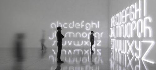
BIG | Alphabet of Light

Danish firm BIG (Bjarke Ingels Group) has created a modular lighting system that can be rearranged to form different letters of a bespoke typeface.
Italian lighting company Artemide worked with architect Bjarke Ingels of BIG to create the ‘Alphabet of Light’ lamps. The alphabet series evolved from BIG’s creation of a new typeface that was translated and manifested as lighting modules that can be utilized either in straight or curved formats. The series use precise geometric proportions with elements of LED strip lights joined together by magnets that can be combined to build countless light structures, both essential and complex.


Tuesday, February 21, 2017

GRAPHIC MEANS | Before Design was Digital


It’s been roughly 30 years since the desktop computer revolutionized the way the graphic design industry works. For decades before that, it was the hands of industrious workers, and various ingenious machines and tools that brought type and image together on meticulously prepared paste-up boards, before they were sent to the printer.

The documentary, Graphic Means explores graphic design production of the 1950s through the 1990s—from linecaster to photocomposition, and from paste-up to PDF. 


WATCH TRAILER | Graphic Means

Friday, February 17, 2017

THE NEW TYPOGRAPHY

In the 1920s and 1930s, The New Typography movement brought graphics and information design to the forefront of the artistic avant-garde in Central Europe.

Letterforms were recognized by supporters of The New Typography as having formal properties alongside their linguistic function. From this simple observation, they created a system of graphic design that operated on abstract principles yet opened up limitless possibilities for layout, artistic expression, and clarity of communication. Rejecting superfluous elements and the traditional arrangement of type in symmetrical columns, designers organized the printed page and poster as blank fields in which blocks of type, bold colors (in many cases, the printed items were 2-color), and illustrations - frequently in the form of photomontage - could be arranged in strikingly asymmetrical yet harmonious compositions. With an emphasis on simplicity and directness of communication, this new movement embraced and circulated the message of modernism around the world.

Taking his lead from currents in Soviet Russia and at the Weimar Bauhaus, the designer Jan Tschichold codified the movement with accessible guidelines in his landmark book Die Neue Typographie (1928). Almost overnight, typographers and printers adapted this way of working for a huge range of printed matter, from business cards and brochures to magazines, books, and advertisements. 

Although young designers are still inspired by The New Typography movement today, working in a simple direct way like that, it’s not as easy as it looks.

Monday, February 13, 2017

KERN TYPE | A Kerning Game

The art of spacing is one of the most difficult aspects of working with letters. But anyone who works with letters extensively knows that good spacing is often more important than good letters. Jan Tschichold, Master Typographer says, “Good lettering demands three things:—(1) Good letters. A beautiful letterform must be selected which is appropriate to the purpose it is to serve and to the lettering technique to be used.—(2) Good design in all details. This calls for well balanced and sensitive letter spacing and word spacing, which takes the letter spacing into account.—(3) A good layout. A harmonious and logical arrangement of lines is essential. None of these three demands can be neglected. Good lettering requires as much skill as good painting or good sculpture.” He goes on to demonstrate “good and bad letters” and how to properly space capitals and lowercase letters. “Letter spacing should not be mechanically equal but must achieve equal optical space. The letters must be separated by even and adequate white areas”. Easier said than done. It is that balance of the inner and outer that makes for ideal letter spacing.

KernType is a game to practice your kerning. Your mission is simple: achieve pleasant and readable text by distributing the space between letters. Typographers call this activity kerning. Your solution will be compared to typographer’s solution, and you will be given a score depending on how close you nailed it. Good luck!

PLAY | http://type.method.ac/

Friday, February 10, 2017

THE BEAUTY OF HANGEUL | The Korean Alphabet

King Sejong the Great invented the Korean alphabet in the 15th century, but two key typeface designers from the modern era shaped it into what it looks like today.

Designers Choi Jeong-ho and Choi Jeong-soon created a blueprint for the Hangeul typeface that's still in use in the present-day, and their creations have made the alphabet more functional and artistically valuable. They designed fonts like Batang Che, which are now essential in the lives of Koreans.

The designers worked out of a sense of duty, as creating fonts did little to alleviate the hardships they would have faced at the time.

The National Hangeul Museum is holding an exhibition of their artifacts and achievements celebrating the 100th anniversary of the birth of the two designers.


WATCH | ​
National Hangeul Museum - Hangeul Learning Center

Tuesday, February 7, 2017

​WIM CROUWEL | New Alphabet & Joy Division


The career of Dutch designer Wim Crouwel spans six decades and covers an extraordinary journey from designer, teacher, curator to museum director.

Based on modernist principles, Crouwel's lucid and systematic approach to design is underpinned by a grid-based methodology. His process​ ​distils a subject down to its absolute essence and in doing so he achieves great impact and purpose in both his exhibition and print design. Through his long and productive career he has produced exemplary work in exhibition design, and designed posters, calendars, typefaces, trademarks and stamps.

In the infancy of digital typography—as lead type, set by hand in heavy lead blocks or by machines that generated lines of metal type, was giving way to text set on screens—Crouwel saw an opportunity for an interesting experiment. Early computer screens—cathode ray tube (CRT) monitors—rendered images in fairly large pixels, making traditional curvilinear letterforms difficult to reconstruct, and so Crouwel set out to redesign the alphabet using only horizontal lines. NEW ALPHABET is, in Crouwel's words, "over-the-top and never meant to be really used," a statement on the impact of new technologies on centuries of typographic tradition. 


In 1988, however, Peter Saville Associates used a stylized version of the font on the cover of Substance, an album for the band Joy Division. NEW ALPHABET was digitized for contemporary use in 1997 by Freda Sack and David Quay of The Foundry, closely based on Crouwel's original studies.

WIM CROUWEL | Talking About Swiss Style 
https://youtu.be/eQCZuN1khPk

Friday, February 3, 2017

ARMIN HOFMANN | Swiss Design Visionary

Armin Hofmann has been described as one of the most outstanding personalities in Swiss graphic design history. Along with the more well known Josef Müller Brockmann, Emil Ruder and Max Bill, Hofmann helped shape modernist-inspired graphic design beyond recognition. Without ‘The International Typographic Style’, also known as the Swiss Style of design, contemporary graphic design would be almost unrecognizable. The readability and cleanliness of the style as well as its asymmetric layouts, use of a grids and sans-serif typefaces have helped define how we design today. Designers today are still taking the best elements from this era of design to create a whole new contemporary, visual aesthetic.

Hofmann was born in Winterthur, Switzerland, in 1920. He studied at the School of Arts and Crafts in Zurich, then worked as a lithographer in Basel and Bern. He then went on to open his own studio in Basel. In 1947 he began teaching at the Basel School of Arts and Crafts after he met Emil Ruder on a train and learned that the school was looking for a new teacher. Hofmann remained there for 40 years and eventually replaced Emil Ruder as the head of the school.

Hofmann felt that one of the best and most efficient forms of communication was the poster and he spent much of his career designing posters, in particular for the Basel Stadt Theater. Just as Joseph Müller-Brockmann and Emil Ruder had done previously, Hofmann also wrote a book outlining his practices and philosophies. His ‘Graphic Design Manual’ was, and still is, an excellent reference book for graphic designers.

The style of design that Hofmann and Ruder created aspired to communication above all else. It showed new techniques of photo-montage, photo-typesetting, experimental composition in general and of course heavily favoured sans-serif typography. It could be said that Hofmann devoted his entire professional life to bringing a creative and artistic integrity to the world of graphic design.

“As a human being he is simple and unassuming. As a teacher, he has few equals. As a practitioner, he ranks among the best” “…He is a rare bird, a daredevil driver, a mountain climber, a teacher par excellence, and a guru. Yet it is difficult, really, to pin him down.”– Paul Rand of Hofmann

Hofmann’s work, especially his poster designs, always seemed to emphasize an economical and efficient use of colour and typefaces. This was in reaction to what Hofmann called the “trivialization of colour.” His posters have been exhibited as works of art in major galleries all around the world, including the New York Museum of Modern Art. He retired in 1987 but his legacy lives on in his hugely influential body of work.

WATCH | Armin Hofmann: AIGA Medalist​  https://youtu.be/pSrNGbwVKQs